Monday 28 February 2011

Planning an event shoot cont...

An excellent reply!

Hi David

We would be happy for you to come down and take some photos. We would only ask that you uploaded a selection of them to the South Manchester facebook group for the runners to ask freely. If you are coming this weekend I will be away, but the Race DIrector will be ... and she will be able to answer any questions on the day. The race starts at 9.00am with the volunteers arriving at 8.15 to do the pre-run set up, meeting outside the boathouse. As it’s a circular route there are plenty of good points to photograph the runners. Let me know which weekend you’ll be joining us.

Best

Paul

The next step is to go to the park and have a wander.
The course is as follows:


I'll have a look when I get there, but I think I'll start at the start, then walk to the edge of the right hand side and catch people running there, then I will walk to the 4K point and see if I can catch people running in the foreground and background and then catch them on the final stretch.

A good time for a 5K is about 25 minutes so I'll have to move quite quickly if there are not many runners.

But the weather report is promising so I am hopeful for a good turnout.

A quick recon trip around the park confirmed the distances between the parts of the course and also provided the idea of having a shot of runners across the pond.


Saturday 26 February 2011

Part Five - Narrative and Illustration: Research

Well I'm now on the final part of the module - yikes! A lot of people in their blogs and on flickr seem to refer to this section as the part where you show off everything that you've learnt so far. I don't know it that was the case in the old version of TOAP or if it's relief at being near the end, but this is a section I have looked forward to because I've never worked with layouts or anything like that, and I like telling stories with photographs and I like sequence shots. I've mentioned Duane Michals before in this blog and I'd like to create something similar to some of his work here.


The first instruction in this section is about researching an event. I've been thinking about doing a parkrun that is quite local to me so I've just fired off an email to them asking if I can photograph next Saturdays run.


Parkruns are free, organised 5K runs that happen all over the UK and are sponsored by the big sports companies. Going off the website they seem to be very friendly, so hopefully they will be open to it.


Tomorrow, I hope to have a positive reply, and following that I will go for a recon trip around the park to come up with a plan for capturing the event.
At the moment, my picture script would be something like this:


  • Shots of organisers setting up
  • Shot of organisers discussing something
  • People arriving
  • Runners scanning their barcode into the reader
  • The starting line
  • The starting pistol (if there is one)
  • Runners at at least 2 different spots around the course
  • The finishing line
  • People celebrating / commiserating etc

Friday 25 February 2011

Assignment 4 - Setups and Rejects

Various shots were rejected for shape. I'm still a bit torn about the image that is top right above but I think the ones I selected are the best. The window shots didn't work amazingly well and the sunset shot I planned never happened as the sun needs to visit Manchester!

My other texture shots focus on the flaws in the metal. I really like these and they are successful images, so I'm prepared if Simon suggests that my smooth shot outside isn't following the brief. 

I tried a few different backdrops for the ice bunny and also a few different contrasts such as the reflector with a lot more light hitting it, and the coffee table. I'm pleased with the two I have selected as none of the above really show the colour any better. 

As can be seen above there were a few different attempts at the window sill shot. All were fine, but I liked having more context. I also tried a few different angles on the balcony shot. 


Here's the Mapplethorpe I have 'aped'


And here's the process of moulding the bunny


Finally here are two of the lighting set-ups I used.

Thursday 24 February 2011

Assignment 4 - Using Lighting Techniques

I'm so tired of taking photos of that bunny!
Although it has been great seeing all of the different ways in which four different qualities of the same object can be shown in very different images using a variety of lighting. I like lighting, both artificial and natural, and whilst some elements of this part have been difficult due to weather, I have really enjoyed the assignment.


For each of the qualities, I decided to focus on them in isolation. There are some images where more than one of the qualities can be seen in detail, but I just wanted to focus on the particular quality under scrutiny.


I chose the brass bunny because it has such a prominent shape but also discreet differences in texture and a nice colour. For all of these photos I used auto white balance, which never lets me down. On some of them I had tweaked it slightly using the manual white balance temperature slider in Lightroom.


Shape


F18
1/100 
I knew I wanted to do this shot as soon as I started thinking about the assignment. I saw this done with a wine glass in a photography magazine. It's a simple technique using a soft-box covered in black material in the middle with two thin strips of light coming through on either side. This leads to the object in questions being lit just from the edges showing it's shape perfectly.
I needed a decent aperture to capture enough of the barely lit object and a shutter speed that allowed me to shoot hand-held.
I am really pleased with this shot, it fits the brief perfectly and shows the great shape of the object.


F9
1/100
For the second shape shot, I wanted to use shadow and whilst there was another that I liked (see previous post) I wanted to capture two shapes at once. The shadow shows a different profile to the actual bunny which exemplifies the shape of the object.
The room was quite dark in order for the shadow to be strong. I used the small, hard flash without any diffusion to create as strong a shadow as possible. The flash was off camera.


Form


F2.5
1/125
Natural light was my choice for the both form shots. I wanted to use a large light source in order to show as many angles of the object as possible. I shot this image at F2.5 in order to throw out any distractions, but I wanted to keep some other objects in the frame such as the wooden shutter and the carved bowl in order to add a sense of depth to the shot, which in turn shows the depth of the object. This image was taken at lunchtime when the sun was at its highest, but it was quite an overcast day so I was confident that the light would be diffused in order to allow the shadows to be soft and all the object's dimensions to be shown.


F2.8
1/50
I decided to use natural light again for the second form image. I'm nervous about this image, not because I'm unhappy with it, but because I think that under scrutiny it could be considered that form is being shown not by the lighting, but by the fish eye lens that I used.
I stand by the image though, I really like this one, I converted it to mono and stressed for ages about whether or not to avoid the colour background. In the end I stuck with the colour because the grass and buildings behind the rabbit are darker and they show depth which gives context to the depth of the bunny. The light was fading when I took this so I had to use my widest aperture and a slower shutter speed than I would have liked (it could be sharper). There was a lot of cloud and the sun was far away so there is little shadow in the image and the curves and bumps of the rabbit can be clearly seen in a way that isn't as noticeable in any of the other photos.


Texture


F5.6
1/100
I took this shot following some of the colour photographs and adapted the lighting accordingly. I wanted the first texture shot to show the chinks in the brass (made by whacking it with a spoon - all in the name of art!). I used one of my studio lights to the front-right of the object and a large softbox behind to light the scene, but dialled down. The front light had no diffusion at all so that the texture was shown with hard shadow. I could have used a wider aperture to increase the detail, and thus show more texture, but I wanted to keep the backdrop blurred so it showed a good contrast.


F8
1/80
I used a portable flash for this shot which was aimed at the bunny's front. Having already captured a shot of the chinks and scratches, I decided to use lighting to make the texture seem smoother than it really is. I used F8 as the sun hadn't set completely and I wanted the background to be darker, but I still wanted some detail, some texture, to make the bunny seem smooth and metallic. The flash was on quite a low power but it was very close to the bunny which allowed all of the detail to be filled with light. The distance of the camera from the rabbit also helps create the impression that it is completely smooth.
This is the other image that I'm nervous about as I worry that I shouldn't be using light to smooth out texture, but enhance. My aim though, was to use a lighting technique to serve a purpose, and I think I have done that.


Colour


F4.5
1/100
The first colour shot was taken with my portable reflector which has a number of different colours and textured surfaces. I decided to use the gold surface to try and increase the bronze colour of the bunny. After some experimentation, I sat the bunny on the reflector as it was flat on the floor, and I used two studio lights, both diffused (soft-box and brolly) to decrease the shadow and show the colour.
I used F4.5 because there was a lot of light flare coming off the reflector and I wanted to minimize it, and I shot at 1/100 as it was hand-held, and I didn't want to lose the light in the background.
I like this image a lot, rather than showing colour by contrast, it shows it through similar shades and the whole image has a warm glow.
F13
1/80
This is the last image and the one that took the most preparation. I wanted to so direct influence from another photographer, and I wanted to show the rich brass colour of the rabbit through a stark contrast. I made the mould of the bunny and created an ice bunny to sit besides it in a nod to Robert Mapplethorpe.
I used a tripod for this image and wanted to get as much detail as I could. I used a large soft-box to light the two bunnys and a hard smaller light against the reflector background.


Overall I am pleased with the results of this assignment. I am sick of taking pictures of the bunny but I feel like I have stretched myself. I didn't use as many of the other inspirational photographs as I originally planned to, but I don't think that this is detrimental to the photographs as they fit the brief better.

Tuesday 22 February 2011

Assignment 4 Rejects

Following feedback on my previous assignment, I decided for the lighting assignment that I would take direct inspiration from famous photographs.
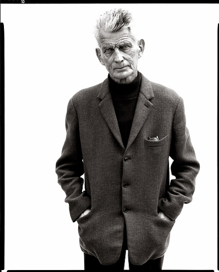
One of the ideas I decided to use as inspiration, was Richard Avedon's signature style of the black and white shot with the high key background and sort of, 3/4 framing.


As you can see from the shot above, I've now done this with my chosen object for the assignment but I've decided to reject it. It would work well for 'shape' but not 'form'. It just doesn't represent the 3D aspects of the shape as it's face on and despite trying a few different lighting types, it just doesn't work.
So I thought I'd at least post it here to show it as a rejected idea, but still a success in some respects!


This is another reject. I've got a load of spares from this assignment, but this is one that I really struggled with. I really like this shot, it fits the 'shape' brief but ultimately I decided to reject it and choose another because the shot that I have chosen meets the 'shape' criteria on two counts - as will be seen in the submission!

Wednesday 9 February 2011

Exercise 40 - Shiny Surfaces

Pre Shoot


I think I'm going to use my lightbox tent for this one. Reading the brief, it's instructions firstly ask you to position an item on the floor and then gets a bit vague about why.


I'm thinking about using a wine glass with water and shooting down into the light tent.


Post Shoot


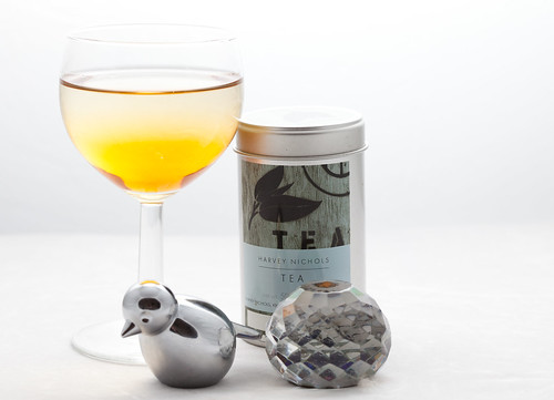
Shiny surfaces was an interesting exercise. I decided that as I have a big lightbox tent thing (another ebay bargain) that it was pointless replicating the same effect with tracing paper and that I should just use the lightbox.


I didn't see the need to show that the tracing paper acts as a light diffused which reduces the reflection, so I went for a still life arrangement taken horizontally rather than a birds eye view.


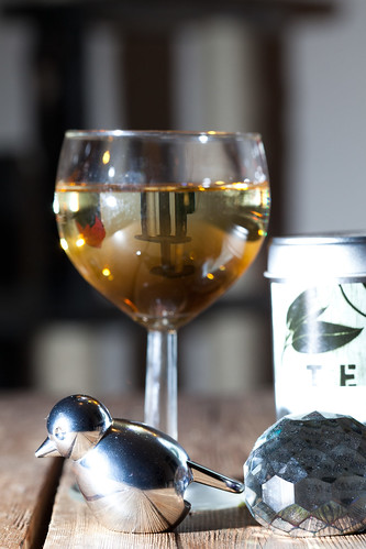
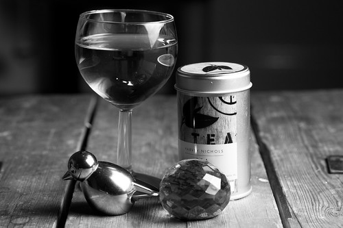
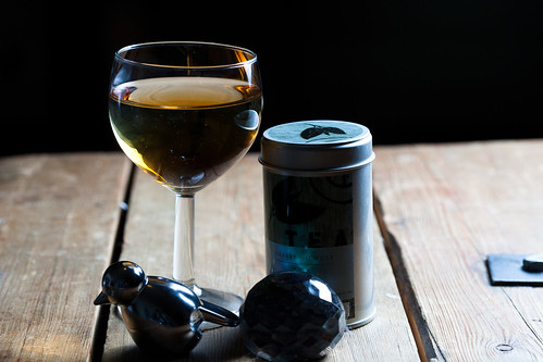
I selected a variety of shiny and reflective objects from around the flat and placed them on the coffee table. I used my 430EXII on the radio trigger and my 100mm macro lens, I left the camera on the same settings as the last exercise, as I hadn't used it in between.


Hard Light Reflections


IMG_9894


IMG_9899


IMG_9901


IMG_9903

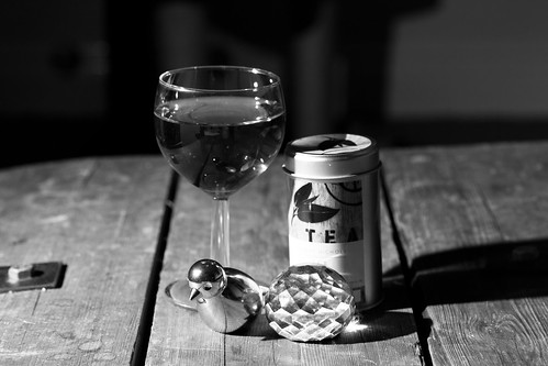
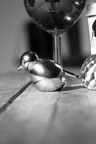
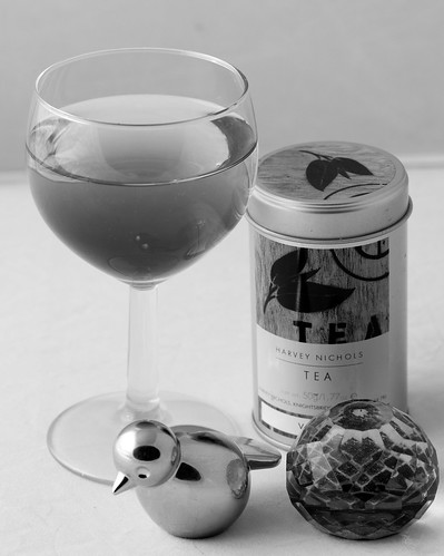
The hard light photos don't show direct reflections of the camera lens or me, but they do show lots of reflections of the light that is aimed at it, and the objects around the room are reflected in the wine glass more often than not.


Just in case anyone wonders - the liquid is water and some soy, didn't want to use clear water as I wanted to see colour reflections.


Diffused

IMG_9904


IMG_9906

For the diffused images I used my softbox and moved it around the objects. I took quite a few images, but have just posted these two here as they were all telling a similar story. The reflections around the room were decreased, but a large reflection was now visible on the bird and crystal paper weight.


The side of the glass also reflected a large bright white reflection. Despite being good for most flash photography, the softbox is actually worse with shiny surfaces.


It's interesting to see how well the detail of the table is shown though. the second image is interesting as the blue/green base of the paperweight is reflected against the side of the tea tin.

Images taken with objects inside lightbox

IMG_9909


IMG_9910

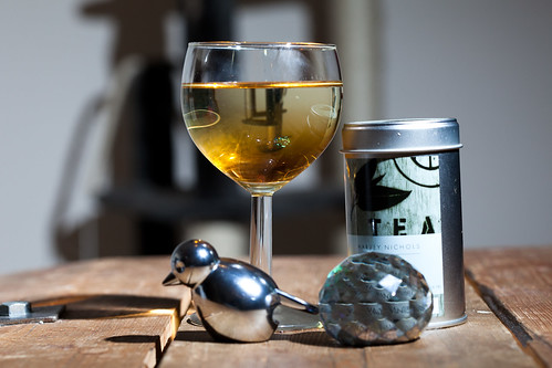
Inside the lightbox the reflections were diminished greatly. In both images above, the layers of colour in the liquid can be seen, almost all of the text on the tea tin can be read and the bird is only reflecting the crystal paper weight, which means that if photographed in isolation, it wouldn't have any reflections in it at all. The textures of the paper weight are also shown.


I know that strictly speaking I haven't followed the instructions, but I have learned more about light reflections on  different types of shiny surface, so I'm happy with that - hope the assessor is!

Assignment Inspiration


This Mapplethorpe image could be parodied with my brass bunny!

Sent from my iPhone

Monday 7 February 2011

Exercise 39 - Concentrating the Light

Pre Shoot Notes

The brief for this exercise is much more open to experimentation than any of the lighting exercises to date. This is good because it would have been very time consuming to replicate an exact copy of another spot lit image.

I will use my snoot attachment for my flash and position it around the room.
Post Shoot

One thing that changed once I had started to shoot, was the placement of the flash and snoot. I could not balance the snoot properly so what I ended up doing was to set the camera on a 2 second delay and hold the snoot and flash myself.

I used my Mr Potato Head again for this task but I also added in a morrocan hurricane lamp and a crystal paper weight.

Moving aroind the still life arrangement, my aim was to light the different parts.
These first four pictures show partial lighting from the side, a full spot light on Mr PH with a nice shadow result, spot light on the lamp with a shadow and a spot light on Mr PH again from the other side.


The second set of four images show a spot light in front of all objects, the paper weight being spot lit, partial side lighting on all objects and a top down spot light.

It's hard to plan exactly where the beam will fall with a flash but fun experimenting.

It's also interesting seeing the difference that the lighting makes to the colours and reflections in the image.

Mr PH looks like he has rosy cheeks in one (top set, top right image)

Sunday 6 February 2011

Exercise 38 - Contrast and Shadow Fill

Regarding these exercises, I'm starting to get into a routine now where I type up the requirements before taking the shot which gives me time to think about it and make sketches etc. So I'm going to try and arrange my exercises with a "before" and "after" section.

Pre Shoot Notes

For this exercise I am not sure whether or not the five images with reflector should use diffused or hard light. So I'll do both and make sure I take careful notes during shooting so I know which is which.

Anyway I will take the following photos to demonstrate contrast levels:

1. Without a diffuser, no reflector
2. With a diffuser, no reflector
3. White reflector opposite, 3ft away, undiffused
4. White reflector opposite, 3rd away diffused
5. White reflector opposite, 1.5 ft away undiffused
6. White reflector opposite, 1.5 ft away diffused
7. Dull foil opposite, undiffused
8. Dull foil opposite, diffused
9. Shiny foil opposite, undiffused
10. Shiny foil opposite diffused
11. crumpled foil opposite, undiffused
12. Crumpled foil opposite diffused

Post Shoot 


Diffuser Shots
IMG_9859

The diffuser shots offer a nice, less contrasty version of the subject. I labelled each shot with the type of diffusion that was used, this isn't easily readable here I know, but the order is the same as the running order above. The image gets less contrast and more filled shadows with the more reflection that is used.

Undiffused Shots
IMG_9858

The undiffused shots show the same pattern except for the crumpled foil seems to have provided more contrast here. I'm assuming that this is because the light concentration is smaller and some of the bounced light will have fallen outside the frame, unlike the diffused light which will have hit the crumpled foil from more angles.

This has been a fun exercise. I have started reading the Light:Science and Magic book thats on the reading list and the exercise has really drawn my attention to some of the examples in the book, especially where it is talking about the family of angles.


- Posted using BlogPress from my iPad

Exercise 37 - The lighting angle

I used my portable softbox again for this exercise an managed to find a model to sit for me, which saved using Mr Potato Head again!


Following the instructions of the exercise, these pictures speak for themselves really. I used a high (for me) ISO of 400 in order to allow for the failing light in the evening.


Light Next to camera


This is a good shot, the softbox sat just to the side of the camera so the 'flat' flash look is avoided.


Light to the model's left


A nice detail of the face, but only one side of the face as shadow dominates too heavily.


Light to the model's behind left


Almost a silhouette, the models shape and defined lines are dominant.


Light behind model


The silhouette shot. This would have been a better shot if the softbox was bigger.


Light to the model's behind right


The same effect is shown, but with less light as the previous behind shot as it was further away from the window light.


Light to the model's right


Again, a similar shot to the left shot.


Light directly above model


Not the most flattering shot, and the least favourite of the model!


Light behind model from above


Another, darker silhouette with not detail of the face at all.


Light in front of model from above


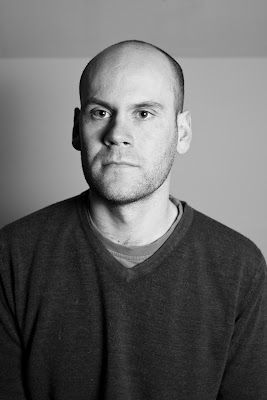
Quite a good shot, probably my favourite as the model's features are shown in quite a flattering light. This is a very masculine shot and would not work with a woman as well. Had he tilted his head up, to allow more light on the eyes, this would have been an excellent shot.


Once I had ticked the exercise boxes, I changed lenses to my 70-200mm and moved further away from the model, which probably relaxed him. of the shots I then took, with the light higher to but to the model's right, this is probably the best in my opinion:


Thursday 3 February 2011

Exercise 36 - Softening the Light

For this exercise I need to take a photo of a still life arrangement using a hard light source and a diffused light source.


I'm quite into photographic lighting so this is an interesting task for me. I currently use two flash units with a few different diffuser 'toys' as well as a pretty good softbox add on.


I do have, as part of my wedding photography, a studio kit with two lights, but I'm going to stick to the flash heads - strobist style for this exercise.


Hard Light Source:


Diffused Light Source:


What are the differences?


The bird is useful here for showing the difference as the hard, small flash light can be seen in the bird's reflective head and the larger source is less easy to make out.
The shadows of the first photo are hard and dominant whereas the shadows in the second photo are more diffused and softer.
The last difference is that the detail of the textures are more prominent with the hard light whereas the softer light fills in the cracks, one of the reasons why its so popular with older people for portraits!


here is my set up:


 The small hard light was a canon 430EX II on a light stand to the side of the objects photographed.


The softer light source was the same flash, using the same settings (I think it was 1/16th on manual).
the difference is the softbox that has been added.
This isn't a true softbox as the light is only diffused through the large white material, when it should be diffused through two pieces of material. But it was a cheap eBay version of the Lastolite EasyBox
http://www.lastolite.com/ezybox.php#

It serves the purpose though and it was a fraction of the price!