Tuesday 28 December 2010

Assignment 3 - Prep Work

I'm currently working on Assignment 3 and I thought I'd update some of the notes that I have made regarding the make-up colour shoot that I have planned.


The first stage of the plan was to buy some make-up which I must say, having never done before, it's really expensive! I'm not sure how women manage to buy it, but I have been assured by my model, Andrea, that it lasts a long time. So the first notes were made, using the trusty iPad and the Adobe Ideas App, based on the makeup that I have bought.
The next step was to work out the best combinations of colours from what I had bought. I had selected certain items from around the colour wheel and I wanted to make sure that whilst I was demonstrating the different colour combinations, I didn't make my model look like a clown! The colours needed to be muted and complimentary. 


The photos have been taken and I am very happy with them, but I want to wait until I have all of my colour photographs for assignment 3 before I put anything on here.


I have also completed the water drop series of photos which I am quite happy with. I have started doing some found pieces, but am not thrilled with the results so far. It's a very drab time of year to do this project but I am determined not to let that stop me!

Photographer Awareness

Henri Cartier-Bresson - portraits


Biography
Born August 22, 1908 and died August 3, 2004. A French photographer who toured America with his exhibitions


What was he famous for?
Being the Father of Photojournalism. He was one of the first professional photographers to use the 35mm format and he helped develop street photography


Interesting Facts
He founded the Magnum Photos co-op with Robert Capa, David Seymour, and George Rodger


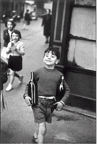
Photograph that most speaks to me


I love the expression of satisfaction on the young boys face as he carries the bottles. The composition works effortlessly as his motion is perpetuated by the angle of the frame.


Alexander Rodchenko - montage and alternative angles


Biography
Born 5 December 1891 died December 3, 1956


What was he famous for?
Using odd angles to postpone recognition


Interesting Facts
He wanted to liberate photography from conventions and from the standard belly-button perspective and thus he evolved into a distinct pioneer of photographic Constructivism


Photograph that most speaks to me

Girl with Leica - I like this because the eye follows the pattern first before it recognises the woman sitting on the bench, in fact the camera is the last thing you notice.


Duane Michals - photo sequences


Biography
born February 18, 1932, still living


What was he famous for?
He is famous for using sequences of photos to tell stories


Interesting Facts
He didn't use a studio which made him stand out from


Photograph that most speaks to me

The Dream Of Flowers - I like this one because even though I don't generally like his staged sequences, this one seems to flow better and whilst the flowers are clearly placed, the placement has been done well so it does suggest the man is falling deeper into sleep.


Peter Keetman - abstracts
Biography
Born April 27th 1916 in Elberfeld , died March 8 2005 in Marquartstein


What was he famous for?
Water drops and abstracts


Interesting Facts
He was one of the founder-members of the Fotoform group in 1949 with OTTO STEINERT and others.


Photograph that most speaks to me


I really like this shot, the image merges abstract and reality in a way i haven't really seen before.

Tuesday 21 December 2010

Exercise 27 - Colours into tones in black and white


This was an interesting exercise which has left me curious about some of my previous black and white imagery and whether or not I could have drawn attention to different parts of the image by changing the colour filters.
I know that these images above are not as clear as they could be, but using the moxier app on the iPad is a much more effective way for me to make notes. The good thing is that they are posted to Flickr so that they can be seen more clearly.

Update - I have uploaded the originals to blogger so that they can be seen easier.


Posted using BlogPress from my iPad

Exercise 26 - Colour Relationships - Part 2

Considering colours in combinations that appeal to me was interesting. I started off with a Christmas display in my local John Lewis store. The display consists of red, yellow, teal, orange, magenta and violet circles hanging down in columns. This is quite a complicated combination of colours and the whilst the yellow and violet are complimentary, as are (with a stretch of definition) the magenta and teal, there are some contrasting colours combinations here, orange and violet, teal and violet and yellow and red. but this works, it is a celebration of colour and I think that the contrasts are balanced out by the complimentary relationships and the fact that each colour is equally balanced in size and number of circles.


The next combination of colours that appealed to me was a family knitted quilt which serves the crucial purpose of stopping the cats from scratching the sofa arms. 
The colours here are quite subdued due to being dyed wools that are quite old, but the reds, oranges and violets are quite dominant in the photo and these colours are next to each other on the colour wheel, and shown in the image in different hues, so they work well together, to the point that the small amount of blue isn't noticeable until the photo is scrutinised.


Of all of the complimentary colours on the wheel, my favourite combination is red and green. I like these colours together because green is so natural and red is so deep, they work together and create different meanings. The other reason why this works is that it features in nature so often with many different red fruits, leaves, berries and flowers all being supported by green stems or branches. The mossy wall shows a subdued version of the colours but it is still a combination that works well. 

Assignment 3 - Ideas

Here are my current working notes for the next assignment.


Assignment Three - Planning

A - Colour Harmony: Complimentary Colours
Yellow and purple, orange and blue, red and green
B - Colour Harmony: Similar Colours
green and yellow, yellow and orange, orange and red, red and violet, violet and blue, blue and green
C - Colour Contrast
Yellow and red, orange and violet, violet and green, green and orange, blue and yellow, blue and red
D - Colour Accent
Any spot Colour

Ideas
  1. Fashion shots with Andrea
  2. Colored water drops
  3. Flowers on graves
  4. Powdered paint / Lego / boats and buildings / front doors / colored gels


Fashion shoot plan
A. Green nails held against face with red lips
B. Pink lashes with purple eye shadow
C. Red lipstick and blue glasses
D. Depending on models eye colour, blue or green eye shadow with black sparkle lashes
Shooting order - C, A, B, D

Colored drops plan
A. Orange and blue
B. Green and yellow
C. Blue and yellow
D. Pink or blue

Sunday 12 December 2010

Exercise 26 - Colour Relationships - Part 1

The first part of this exercise was relatively simple in execution but difficult to decide what the subject was. I decided it would be fun to go to a department store and rearrange things to suit my needs. 


Red and Green 1:1
For the red/green image I picked two different shapes to try and play with the different weightings of the colour but with an even proportion. I like this image as it makes you take a second look before you really see that the colour weighting is reasonably even. In retrospect I should have moved the plate and cups from around the bottom of the image.


Yellow and Violet 1:3
I'm really pleased with this picture. I tried a few different objects in the store which weren't really the right proportions but this works well even though the yellow is sporadic flashes across the image.
Orange and Blue 1:2
The proportions of this image were easy because I found two cushions that were blue and one which was orange and placed them together. The image was composed in the camera so that none of the area around the cushions was visible. This leads to a strong image with the complimentary colours.


Overall I think the 3 images show the colour relationships well and adjusting the proportions wasn't an issue for the yellow/violet or orange/blue photos, but as I said above, I probably should have prepared the scene better for the red/green picture.


I think these images show that the colours opposite each other on the wheel have very definite and pleasing relationships with each other when used in the right ratios.

Thursday 9 December 2010

Richard Avedon

Another short post I'm afraid, things are manic and the moment. I'm currently working on my colour ratio exercise but a wedding last weekend has meant a week of photo editing.
On with the photographers.

Biography
Born in New York in 1923, died in 2004.

What was he famous for?
Celebrity portraits

Interesting Facts
In the 1960s Avedon branched out into photo-journalism and recorded the Civil Rights movement, Vietnam at war and paitents in mental hospitals.

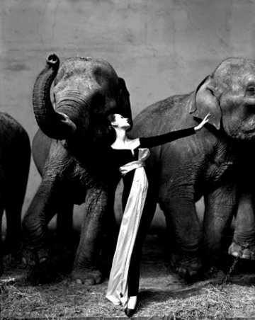
Photograph that most speaks to me

I love this image, I like the dynamic movements of the elephants and the posed, dignity of the model.

Wednesday 1 December 2010

Exercise 25 - primary and Secondary Colours

This exercise was interesting and a challenge and I must say that the challenge was not entirely met! By this I mean that I had extremely high hopes about how I was going to capture the different primary colours but sadly winter and work impeded me greatly. I have managed to capture the primary and secondary colours, but I would have liked the images to be more interesting / creative / original!

Yellow 
This novelty crocodile clip was the yellowest item to hand after a series of photos taken in a flower shop( whilst being rushed by my nearest and dearest) turned out to be out of focus.
The shot shows the vibrance of the colour and I like the warmth it adds to the grey folder.


Blue
This Yankee Candle works well as a subject for blue especially with the pale blue walls in the background. the scene is cluttered but the shadow adds an element of dynamism to the shot. The blue isn't identical to the blue of the colour wheel, even after saturation tweaking in post production and this was the colour I had the hardest time capturing.
Red
There are a lot of opportunities to capture the colour red. I initially tried capturing car tail lights but the camera sensor picks up less of the red colour than the human eye. I eventually settled on a poinsettia given the time of year and its impressive redness.
Green
I also used the same plant for the green photo. There are so many variations of green it is amazing once you start looking at them all. I think of the primary colours, the green hues are the most different and have the broadest range.

Violet

Another difficult colour to find. I wanted to avoid anything that seemed too purple as I will freely admit to struggling to differentiate between them. This image shows violet wrapping paper with purple labels. Its a useful image for me as it helps remind me of the differences.


Orange

I think 50% of TOAP must photography oranges for this task. Although maybe I am the only person so unoriginal as to do so.
These dried oranges form a christmas decoration and they appealed to me as the fruit is dried but the colour has lost none of its vibrance.