Pre-Shoot
I read this exercise a while ago so the next time I saw rain, I started taking some pictures. I decided not to use any of the rain pictures produced for the lighting section as I wanted to take pictures with the idea of a magazine cover focused in my mind.
Post-Shoot
After I took the photos I waited until I got the the exercise. I've done this in advance of exercises 43 and 44 but mainly because I want to mull over the symbols for a bit and frankly I was looking forward to this one so I skipped ahead!
I've never done any type-facing or layout before so this was really fun. The following covers were made in order shown with the last one being my favourite.
This is my first attempt. I didn't want to go with a weather themed magazine cover and I must admit, I was a bit stumped about what sort of magazine would have rain as a cover story. So I don't know if this is the wrong way round, but I took the photos first and came up with the idea second.
I like this cover and I think it works well. The image shows the possible perspective of someone looking out their window and considering the dismal prospect of not being able to hang their laundry!
This was my next attempt. I really liked the rain image, but I don't think it works as a cover shot as the branches are too prominent.
Also, I had to use colour backdrops with most of the text to make it readable.
This doesn't work, and doesn't look like a real cover.
So this was abandoned.
Then I used my last, and favourite photo.
I like the image because it's not immediately obvious what it is a picture of, and from a layout perspective the blurs caused by the rain on the window allow for easy to read text so...
After playing around with it, here is the final image.
I'm really pleased with this and think it fulfills the task requirements well.
Showing posts with label Exercise. Show all posts
Tuesday, 15 March 2011
Exercise 43 - Symbols
A thought exercise! I haven't done one of these since an Oxford Philosophy distance learning course I did years ago.
Anyway, thinking of symbols for a number of concepts. I need more than one symbol for each subject and a short note explaining how I could use it in a photograph.
Growth
seeds, saplings, vines.
Nature springs to mind immediately. You could have a series of marks on a door frame with a child's age written next to it. A certain mind set might verge towards some more adult symbolism!
I think if I was to take a single photograph to represent growth, I would probably lie flat on the ground, find a sprouting blub and use the fish eye lens - which I'm a bit obsessed with at the moment.
Excess
Food! Burger wrappers spilling out of a bin, Gregs bags which contribute to so much litter.
Symbols of excess should be immediate and in your face. I like the idea of taking a picture of a man with a load of gold jewellery and teeth or a woman wearing furs standing in a grand hallway with lots of gaudy chintz.
Being realistic, if I were to take this photo now, I'd go for food excess and get someone swigging a milkshake whilst they had food down their face and a burger in their hand. Food excess is the easiest to access to seems like a lazy choice, but because it is the easiest to access, it's one of our societies biggest problems.
Crime
Symbols of crime are often closely associated with symbols of punishment, a masked man, striped prison tops, multiple arrows, bars, locks, crowbars etc.
I'd like to take a picture that showed corporate crime where a man could be seen at a desk in a respectable shot, but there were small indicators around the scene that indicate his criminal nature. There could be some files marked confidential, a report of fraud, a variety of credit cards in different names, or passports with different names and the same man in each of them. There could be a small bag of concrete on the floor leaning on the desk with some rope and a pair of black leather gloves etc.
Silence
Symbols for silence, hmm, this is a more difficult one. A gagged man, one of those orange bills like the gimp in pulp fiction wore. Silence can be evoked by emptiness, a room with the door left open or a dark street at night. Anywhere where there should be, but arent people. An empty escalator. I'd take a picture of two people sat staring at each other with their mouths closed.
Poverty
Poverty can be shown through symbols of waste, dereliction and most importantly through people. Where clothes are torn or dirty and people look malnourished or diseased.
this is a difficult one to plan a photo for. I wouldn't want to take a photo of real poverty under these circumstances and faking it seems brutal. An empty purse would be a good work around. Or a bank statement with a hefty minus figure.
Exercise 44 - Juxtaposition
I wanted to do The Lion The Witch And The Wardobe for this but despite having a very lion-like cat called Aslan I couldn't find a witch or mini wardrobe!
So a quick glance at the bookshelf and I saw Neil Gaiman's Smoke and Mirrors, a collection of short stories.

And I came up with this. What I like about it is that the name of the book is also the same as a common phrase so the juxtaposition between the candle, smoke and mirror creates and obvious meaning.
Monday, 14 March 2011
Exercise 42 - Evidence of Action
This image shows evidence of an event. There are 2 main props, the empty wallet, the bloody knife and the obscured body.
I used my fish eye so that the edges of the scene were warped and the eye would be drawn to the centre of the image which is where all of the evidence is.

Looking at it now, I should have moved the objects around a bit to make the eye search the image, but it works ok as it is.
I decided to do the image as an HDR because I haven't done one for ages. I took nine exposures, three using auto-exposure bracketing and six using white balance bracketing. I then merged them in photoshop.
I used the self timer and posed in the shot myself.
Saturday, 5 March 2011
Exercise 41 - A Narrative Picture Essay
Pre-Shoot Planning - see previous post
Post Shoot Thoughts:
This went well, but I'm not going to write much about it, as a narrative picture essay, it should tell its own story:
Post Shoot Thoughts:
This went well, but I'm not going to write much about it, as a narrative picture essay, it should tell its own story:
Monday, 28 February 2011
Planning an event shoot cont...
An excellent reply!
Hi David
We would be happy for you to come down and take some photos. We would only ask that you uploaded a selection of them to the South Manchester facebook group for the runners to ask freely. If you are coming this weekend I will be away, but the Race DIrector will be ... and she will be able to answer any questions on the day. The race starts at 9.00am with the volunteers arriving at 8.15 to do the pre-run set up, meeting outside the boathouse. As it’s a circular route there are plenty of good points to photograph the runners. Let me know which weekend you’ll be joining us.
Best
Paul
The next step is to go to the park and have a wander.
The course is as follows:
I'll have a look when I get there, but I think I'll start at the start, then walk to the edge of the right hand side and catch people running there, then I will walk to the 4K point and see if I can catch people running in the foreground and background and then catch them on the final stretch.
A good time for a 5K is about 25 minutes so I'll have to move quite quickly if there are not many runners.
But the weather report is promising so I am hopeful for a good turnout.
Saturday, 26 February 2011
Part Five - Narrative and Illustration: Research
Well I'm now on the final part of the module - yikes! A lot of people in their blogs and on flickr seem to refer to this section as the part where you show off everything that you've learnt so far. I don't know it that was the case in the old version of TOAP or if it's relief at being near the end, but this is a section I have looked forward to because I've never worked with layouts or anything like that, and I like telling stories with photographs and I like sequence shots. I've mentioned Duane Michals before in this blog and I'd like to create something similar to some of his work here.
The first instruction in this section is about researching an event. I've been thinking about doing a parkrun that is quite local to me so I've just fired off an email to them asking if I can photograph next Saturdays run.
Parkruns are free, organised 5K runs that happen all over the UK and are sponsored by the big sports companies. Going off the website they seem to be very friendly, so hopefully they will be open to it.
Tomorrow, I hope to have a positive reply, and following that I will go for a recon trip around the park to come up with a plan for capturing the event.
At the moment, my picture script would be something like this:
- Shots of organisers setting up
- Shot of organisers discussing something
- People arriving
- Runners scanning their barcode into the reader
- The starting line
- The starting pistol (if there is one)
- Runners at at least 2 different spots around the course
- The finishing line
- People celebrating / commiserating etc
Wednesday, 9 February 2011
Exercise 40 - Shiny Surfaces
Pre Shoot
I think I'm going to use my lightbox tent for this one. Reading the brief, it's instructions firstly ask you to position an item on the floor and then gets a bit vague about why.
I'm thinking about using a wine glass with water and shooting down into the light tent.
Post Shoot
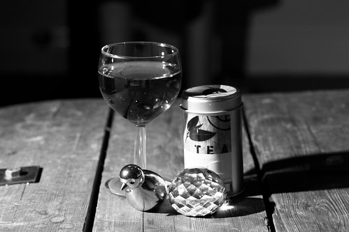
Shiny surfaces was an interesting exercise. I decided that as I have a big lightbox tent thing (another ebay bargain) that it was pointless replicating the same effect with tracing paper and that I should just use the lightbox.
I didn't see the need to show that the tracing paper acts as a light diffused which reduces the reflection, so I went for a still life arrangement taken horizontally rather than a birds eye view.
I selected a variety of shiny and reflective objects from around the flat and placed them on the coffee table. I used my 430EXII on the radio trigger and my 100mm macro lens, I left the camera on the same settings as the last exercise, as I hadn't used it in between.
Hard Light Reflections


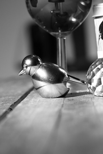
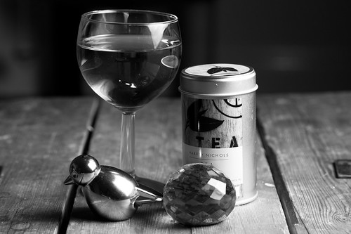
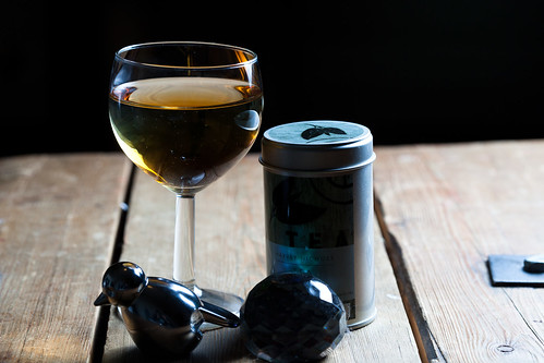
The hard light photos don't show direct reflections of the camera lens or me, but they do show lots of reflections of the light that is aimed at it, and the objects around the room are reflected in the wine glass more often than not.
Just in case anyone wonders - the liquid is water and some soy, didn't want to use clear water as I wanted to see colour reflections.
Diffused


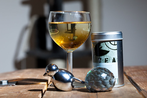
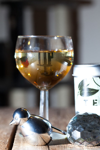
For the diffused images I used my softbox and moved it around the objects. I took quite a few images, but have just posted these two here as they were all telling a similar story. The reflections around the room were decreased, but a large reflection was now visible on the bird and crystal paper weight.
The side of the glass also reflected a large bright white reflection. Despite being good for most flash photography, the softbox is actually worse with shiny surfaces.
It's interesting to see how well the detail of the table is shown though. the second image is interesting as the blue/green base of the paperweight is reflected against the side of the tea tin.
Images taken with objects inside lightbox


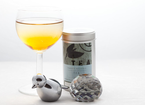
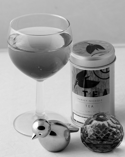
Inside the lightbox the reflections were diminished greatly. In both images above, the layers of colour in the liquid can be seen, almost all of the text on the tea tin can be read and the bird is only reflecting the crystal paper weight, which means that if photographed in isolation, it wouldn't have any reflections in it at all. The textures of the paper weight are also shown.
I know that strictly speaking I haven't followed the instructions, but I have learned more about light reflections on different types of shiny surface, so I'm happy with that - hope the assessor is!
Monday, 7 February 2011
Exercise 39 - Concentrating the Light
Pre Shoot Notes
The brief for this exercise is much more open to experimentation than any of the lighting exercises to date. This is good because it would have been very time consuming to replicate an exact copy of another spot lit image.
I will use my snoot attachment for my flash and position it around the room.
Post Shoot
One thing that changed once I had started to shoot, was the placement of the flash and snoot. I could not balance the snoot properly so what I ended up doing was to set the camera on a 2 second delay and hold the snoot and flash myself.
I used my Mr Potato Head again for this task but I also added in a morrocan hurricane lamp and a crystal paper weight.Moving aroind the still life arrangement, my aim was to light the different parts.
These first four pictures show partial lighting from the side, a full spot light on Mr PH with a nice shadow result, spot light on the lamp with a shadow and a spot light on Mr PH again from the other side.
The second set of four images show a spot light in front of all objects, the paper weight being spot lit, partial side lighting on all objects and a top down spot light.
It's hard to plan exactly where the beam will fall with a flash but fun experimenting.
It's also interesting seeing the difference that the lighting makes to the colours and reflections in the image.
Mr PH looks like he has rosy cheeks in one (top set, top right image)
Sunday, 6 February 2011
Exercise 38 - Contrast and Shadow Fill
Regarding these exercises, I'm starting to get into a routine now where I type up the requirements before taking the shot which gives me time to think about it and make sketches etc. So I'm going to try and arrange my exercises with a "before" and "after" section.
Pre Shoot Notes
For this exercise I am not sure whether or not the five images with reflector should use diffused or hard light. So I'll do both and make sure I take careful notes during shooting so I know which is which.
Anyway I will take the following photos to demonstrate contrast levels:
1. Without a diffuser, no reflector
2. With a diffuser, no reflector
3. White reflector opposite, 3ft away, undiffused
4. White reflector opposite, 3rd away diffused
5. White reflector opposite, 1.5 ft away undiffused
6. White reflector opposite, 1.5 ft away diffused
7. Dull foil opposite, undiffused
8. Dull foil opposite, diffused
9. Shiny foil opposite, undiffused
10. Shiny foil opposite diffused
11. crumpled foil opposite, undiffused
12. Crumpled foil opposite diffused
Post Shoot
Diffuser Shots
Diffuser Shots
The diffuser shots offer a nice, less contrasty version of the subject. I labelled each shot with the type of diffusion that was used, this isn't easily readable here I know, but the order is the same as the running order above. The image gets less contrast and more filled shadows with the more reflection that is used.
Undiffused Shots

The undiffused shots show the same pattern except for the crumpled foil seems to have provided more contrast here. I'm assuming that this is because the light concentration is smaller and some of the bounced light will have fallen outside the frame, unlike the diffused light which will have hit the crumpled foil from more angles.
This has been a fun exercise. I have started reading the Light:Science and Magic book thats on the reading list and the exercise has really drawn my attention to some of the examples in the book, especially where it is talking about the family of angles.
- Posted using BlogPress from my iPad
Exercise 37 - The lighting angle
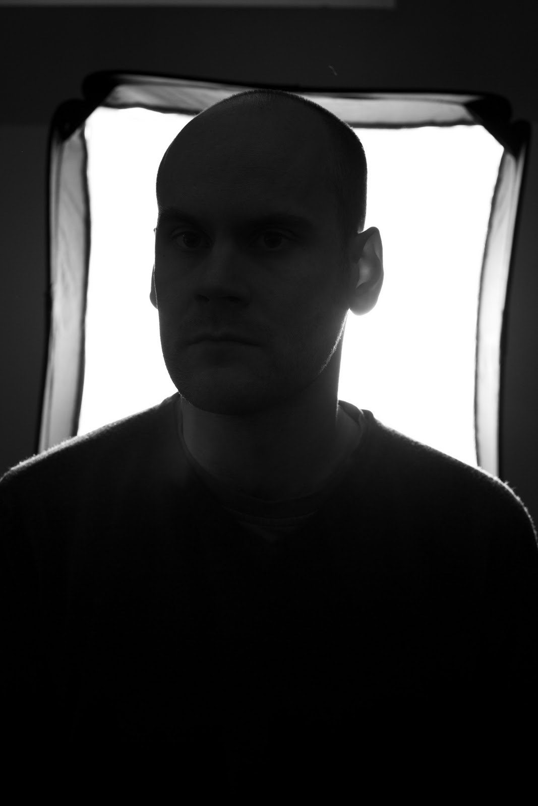
I used my portable softbox again for this exercise an managed to find a model to sit for me, which saved using Mr Potato Head again!
Following the instructions of the exercise, these pictures speak for themselves really. I used a high (for me) ISO of 400 in order to allow for the failing light in the evening.
Light Next to camera
This is a good shot, the softbox sat just to the side of the camera so the 'flat' flash look is avoided.
Light to the model's left
A nice detail of the face, but only one side of the face as shadow dominates too heavily.
Light to the model's behind left
Almost a silhouette, the models shape and defined lines are dominant.
Light behind model
The silhouette shot. This would have been a better shot if the softbox was bigger.
Light to the model's behind right
The same effect is shown, but with less light as the previous behind shot as it was further away from the window light.
Light to the model's right
Again, a similar shot to the left shot.
Light directly above model
Not the most flattering shot, and the least favourite of the model!
Light behind model from above
Another, darker silhouette with not detail of the face at all.
Light in front of model from above
Quite a good shot, probably my favourite as the model's features are shown in quite a flattering light. This is a very masculine shot and would not work with a woman as well. Had he tilted his head up, to allow more light on the eyes, this would have been an excellent shot.
Once I had ticked the exercise boxes, I changed lenses to my 70-200mm and moved further away from the model, which probably relaxed him. of the shots I then took, with the light higher to but to the model's right, this is probably the best in my opinion:
Thursday, 3 February 2011
Exercise 36 - Softening the Light
For this exercise I need to take a photo of a still life arrangement using a hard light source and a diffused light source.
I'm quite into photographic lighting so this is an interesting task for me. I currently use two flash units with a few different diffuser 'toys' as well as a pretty good softbox add on.
I do have, as part of my wedding photography, a studio kit with two lights, but I'm going to stick to the flash heads - strobist style for this exercise.
Hard Light Source:
Diffused Light Source:
What are the differences?
The bird is useful here for showing the difference as the hard, small flash light can be seen in the bird's reflective head and the larger source is less easy to make out.
The shadows of the first photo are hard and dominant whereas the shadows in the second photo are more diffused and softer.
The last difference is that the detail of the textures are more prominent with the hard light whereas the softer light fills in the cracks, one of the reasons why its so popular with older people for portraits!
here is my set up:
The small hard light was a canon 430EX II on a light stand to the side of the objects photographed.
The softer light source was the same flash, using the same settings (I think it was 1/16th on manual).
the difference is the softbox that has been added.
This isn't a true softbox as the light is only diffused through the large white material, when it should be diffused through two pieces of material. But it was a cheap eBay version of the Lastolite EasyBox
http://www.lastolite.com/ezybox.php#
It serves the purpose though and it was a fraction of the price!
Subscribe to:
Posts (Atom)